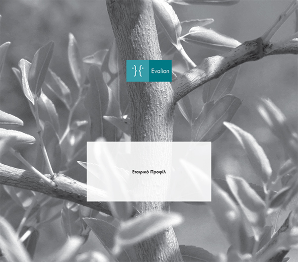
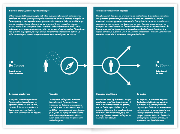
Evalion provides and develops solutions for HR management and vocational guidance. The company has been operating since 1991 under the name “SHL Hellas”. The company decided to abandon the multinational company’s name and identity in 2012, still keeping a strong partnership with it, but focusing a bit more on the human factor by customising its services in a way that the human is the most dominant element in its identity.
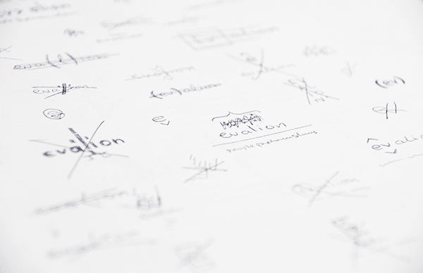
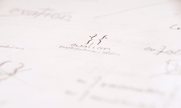
The initial ideas were based on two main directions; the first one contained a combination of elements being used in psychometric tests and the human element, whilst the second one was structured around elements of the broader science of psychology. By creating samples of what the accompanying identity and aesthetics would look like, the preference was made for the second direction. The logo contained such elements, which would help to further highlight the simplicity of the company’s products.
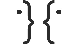
The idea was developed around symbols and tools of the science of psychology, such as the uppercase Greek letter Psi (Ψ), Rubin’s vase, and Rorschach inkblot test cards. The final design is constructed by using two Greek upper dots and two facing brackets; the sequence of the characters builds a form of two faces.

![]()
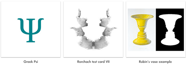
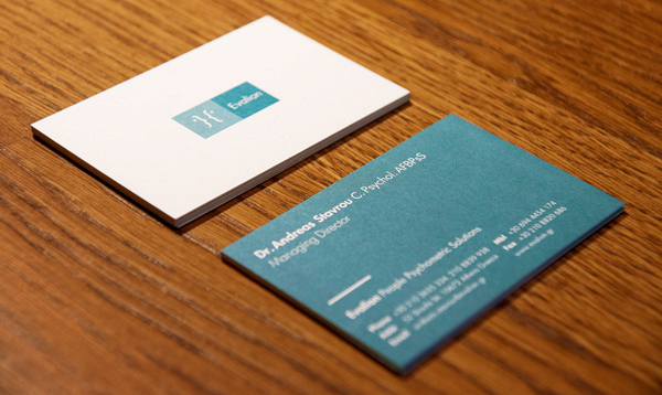
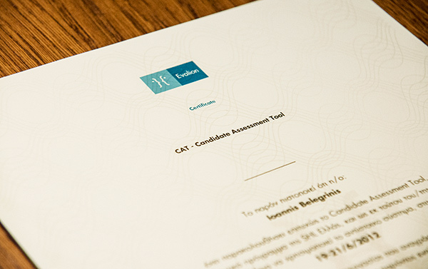
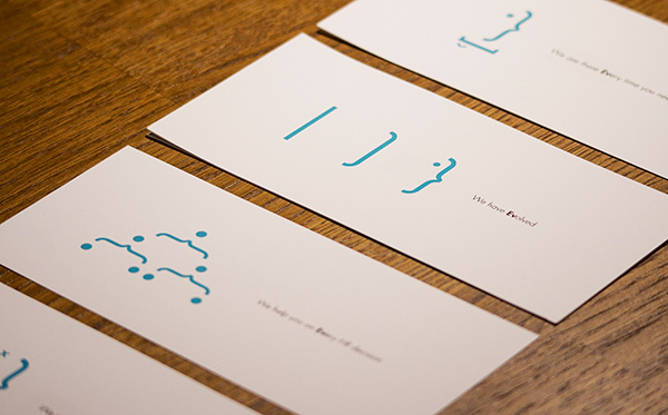
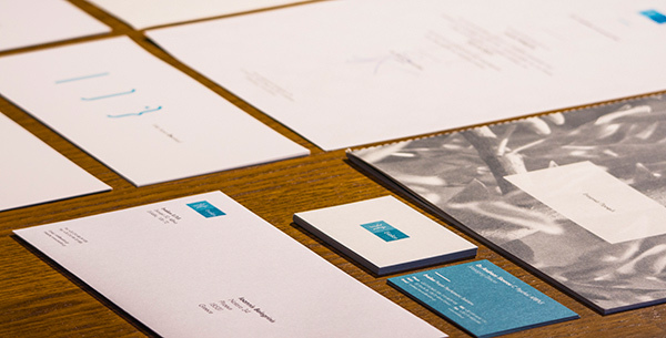


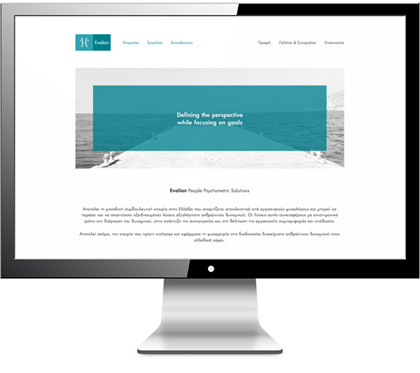
One thing to have in mind is the shape that a Rubin vase’s negative space creates, which the two faces reflects in the best possible way.
Another factor to have in mind is the fact that a lot of psychometric tools’ end-users are not able to use graphics on their computer systems (e.g. restricted PC’s in banks, or educational organisations). Thus the ability of using just characters to reproduce the logo was an important matter during the design process, which the logo addresses very effectively.
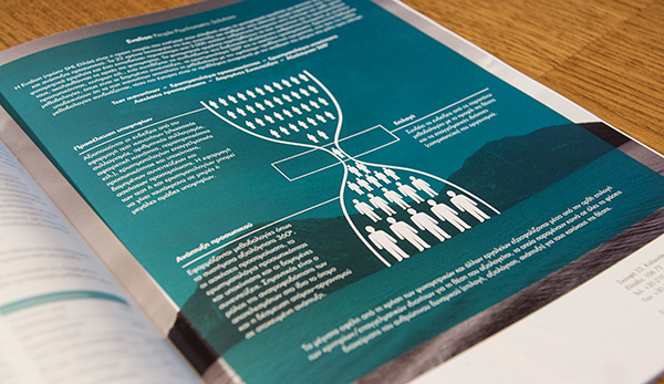
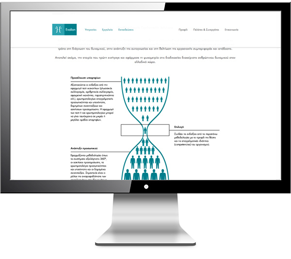
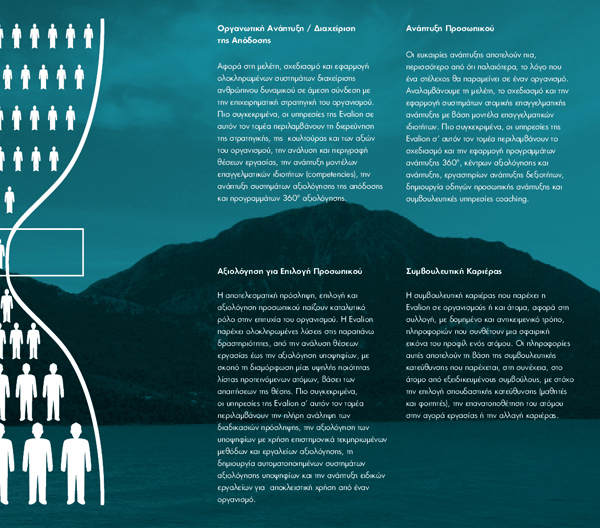
We created several full page ads for HR Professional Greece. The base ad used a recreation of an old hourglass graphic which describes the phases at which Evalion’s tools operate; from selection to development.
